Case study
The Seattle Times iOS app
Redesign of the outdated mobile experience. The main focus was providing a way to easily navigate and read articles from a main news feed.
Identifying the key issues and redesign goals
The first step of the app redesign was to do a current-state audit and work with our UX researcher to conduct user interviews to determine the main issues that we faced.
The current app was essentially our mobile site being served in an app “wrapper”. The navigation was poor, pages loaded slowly, and users lacked personalization features.
- Existing app was a mobile website within an app container
- Improve poor navigation for mobile users
- Display news articles in a digestible way, without being too limiting
Target audience
-
 Active user
 -
 Passive user
 -
 Occasional user
We broke our target audience down into three main groups: active users, passive users, and occasional users. We interviewed and polled representatives from each group to learn their respective needs.
- Active user — Everyday user that checks phone throughout the day for news updates
- Passive user — Commuter who only checks during commuting hours
- Occasional user — Readers who only check when breaking news is happening
Wireframes and user testing
After identifying the key areas of the UI to focus on based on user feedback and business goals, I created a series of wireframes to focus on key parts of the app:
- Story presentation
- Relevancy exploration
- Topic / alert preferences
- Trending content
- Paywall messaging and design
These wireframes underwent qualitative user testing to determine which features and layout would accomplish our goals best.
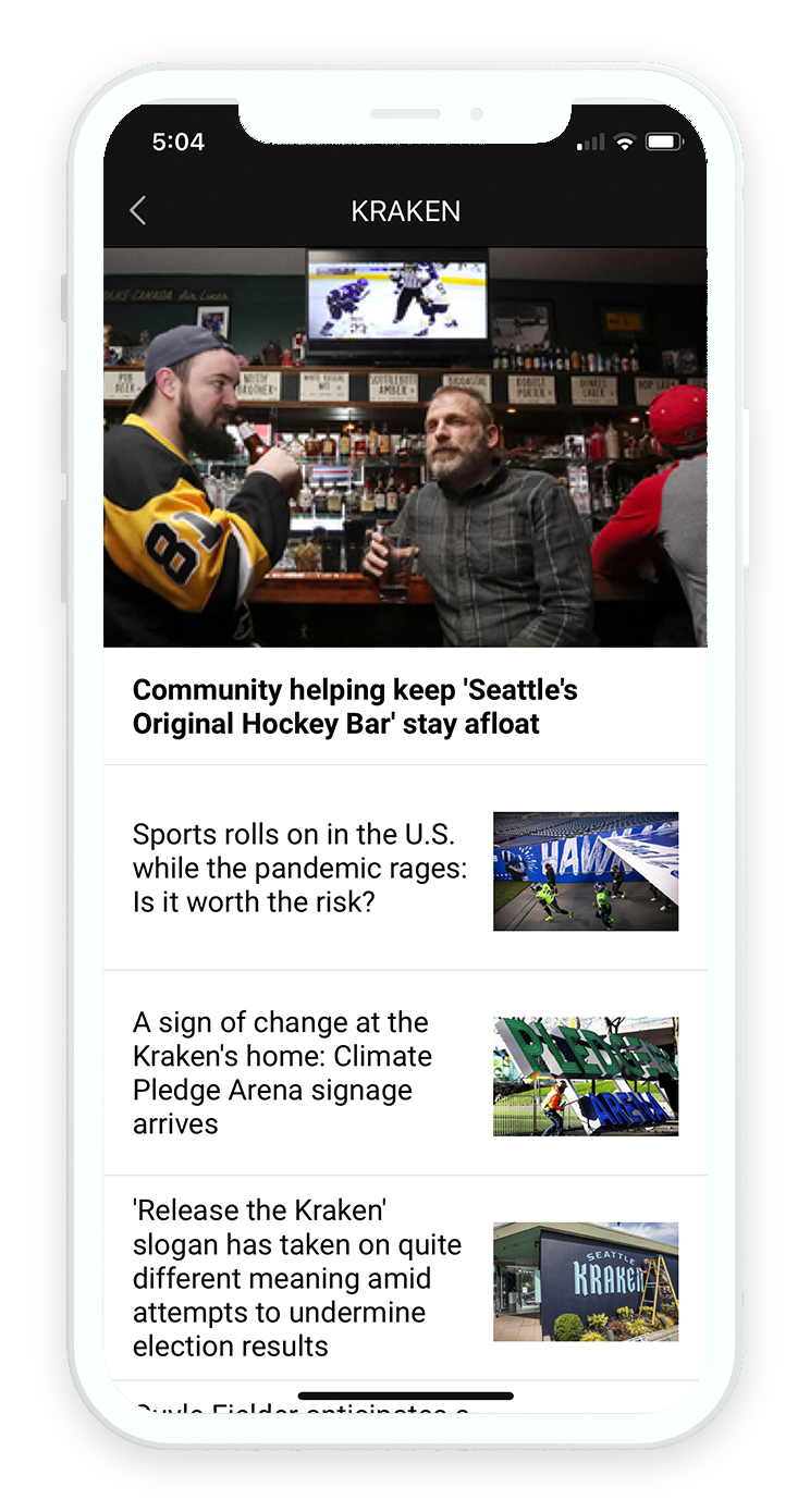
User testing key results:- Having a blended news feed of thumbnails and large images created most engagement while also maximizing the mobile screen real estate.
- Alerts and notification customizations were not as important to users. Users preferred to be alerted for all breaking news as opposed to news section updates.
- Casual readers appreciated having a trending news tab.
- Users assumed that news was chronological in the newsfeed. Calling attention to new articles was unnecessary and created clutter.
Final designs
The final step was visual design for the product. This largely followed the Seattle Times’ brand guidelines, but was tweaked slightly for better accessibility and readability on the app.
Results
- +400% Increase in user traffic compared to previous app
- 4.6 Gained a 4.6-star rating on the app store within 3 months of launch. Previous app had 1-star.
- 2x Double active user count within 3 months