Case study
Animoto in-product checkout optimization
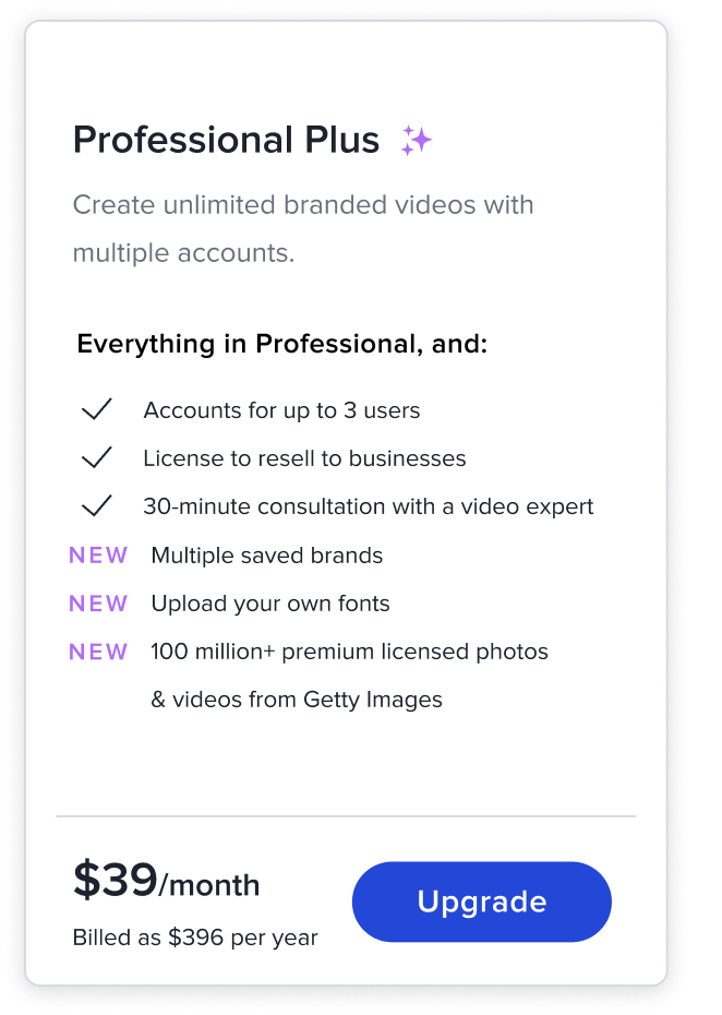
Adding the ability for users to see pricing plan options and checkout within the product was a critical part of making a better user experience and driving monetization of our video editing software.
Identifying issues with the current experience
Users would click an upgrade button within the product, which took them out of the product onto the Animoto pricing page where they could select a plan and check out.
This caused a number of issues for the users, which I investigated by speaking with customer operations, conducting FullStory audits, and interviewing users through Ethnio.
Research, audits, and user interviews
After speaking with customer operations, viewing user sessions through FullStory, and interviewing some of our users through Ethnio, I synthesized the data and came up with three problem statements that our users were facing.
- Being taken from the product was confusing for users
- Users that just wanted to browse our prices left the product and it interrupted their editing flow
- Once on the marketing site, users could easily get distracted leading to a downturn in conversion
Hypothesis
Working with our team’s marketing manager, we came up with a hypothesis that we planned to test with an A/B test. The control would be our current checkout experience compared to the variant, which would be a modal checkout within the product.
If users can check out within the product, it will solve their problems while increasing bookings conversion.
Early design explorations
Following the team’s alignment on a testing plan and hypothesis, we worked on a wide range of wireframes and design explorations, which we narrowed down through a series of internal feedback sessions within the product design team and key stakeholders.
Prototypes for user testing
After deciding on two different design directions, we created a series of Figma prototypes which we tested through Usertesting.com.
A key piece of data that we identified through the rounds of user testing was that users had difficulty understanding what their current payment plan was and what features their current plan had. With that knowledge, we further refined and tested the new designs.
Final designs
After several rounds of user testing and internal feedback, three designs were decided on to run as a live A/B test with the new designs being the variant and the original designs acting as the control.
Results from A/B test
- +112% Increased bookings compared to control (old checkout process)
- -78% Reduction in customer support requests related to checkout
Following the positive A/B test results, the new design was chosen to replace the old process.